A roller banner is one of the most in your face ways to present your brand, product or service.
But the key to a good roller banner, is the design. A poorly designed roller banner can fall flat and not yield the results you had hoped for. Whereas if you think about the design, what you want to achieve with your roller banner and what message you want to get across, the likelihood is that you will see better results.
Here are some of our tops tips on designing a roller banner;
1. Keep your logo at the top.
Use the top of your roll-up banner to display your company’s logo and any pertinent information. Why? Often, it’s the first place that new viewers will look. Follow this down with your main message at eye level. It’s most likely to grab someone’s attention as they walk past it.
2. Think top-to-bottom, left-to-right.
We’re all taught to read from top to bottom and left to right when we’re in school: your consumers are no different. Keep this in mind as you start laying out the flow of information on your banner. Keep it to relevant information only – more information can be provided by your sales team or by using a tabletop banner or backdrop.
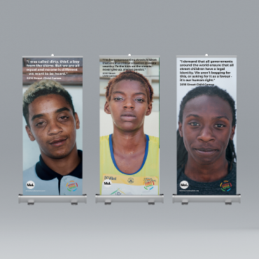
3. Make sure you’re using high-quality images.
Everyone wants to use images on their banners: it’s practically why banners were invented. If you want to use any kind of print-ready images on your banners, make sure they’re saved as CMYK (Cyan, Magenta, Yellow, Black – as opposed to RGB) and the resolution is set to 300 dpi.
4. Colour is your friend.
Colours can help you stand out at an exhibition or trade show, but you have to be careful about it. The colors you use have to work well together, tie in with your corporate colors and overall support your logo. To support your logo best, you have to be aware of the impact that your background color is going to have on how people perceive your logo: for example, black and grey are “serious” colors, while bright colors like red and orange can be used to grab a customer’s attention and draw them in. If you’re unsure what color scheme to pick, or which colours work together, sites like Adobe Color CC are a great way to figure that out.
5. Make use of text and spacing.
Typography is the arrangement of letters and type in a way that’s both readable and artistically appealing. Consider not only the type you’re going to use on your banner, but also the type that you’ve already used, especially in your logo. How you design and use the various typefaces available to you is one of the more important things when it comes to visual and graphic design. Typography can make or break a whole project, and it’s a field that comes with its own set of errors that beginners might not be aware of.
6. Commit to a design aesthetic.
Aesthetics is the study of how our brains interpret things as being beautiful or ugly. If you want your customers to identify with your brand and recognise your products, you need a design aesthetic.
7. Choose the banner size that’s right for you.
Each premium roll up banner is 850mm wide x2000mm tall and is supplied with a padded carrier case and outer box
The size of banner you need depends entirely on your advertising needs. If you need something that can be used to advertise all by itself, go with the larger size. However, if you’re using your roll up banner as a complement to other advertising products, it’s best to go for smaller sizes.