Leaflets or flyers are an important part of any businesses marketing materials, as they are quick and cheap to print. However for them to work it is important that they are printed correctly, or else it will have been time and money wasted. Within this article, we will look at the top tips for printing a flyer and hopefully it can help you on your way to having success with them!

Top Tips
- Title Positioning
- Clarity and legibility
- Image quality
- Colour
- Single or double sided
Title Positioning
The title is going to be the most important part of your flyer and the piece of information that you will want those who see it notice first. Immediately it will tell them what the flyer is about and from there, you will have their attention. In that sense, it is vital that the position, size and legibility of your title is perfect. In terms of size, you want it to be large so that it is noticed immediately, but not so large that it drowns out the rest of the flyer. In terms of position, this goes right along with the size but usually the middle and right at the top is the best place to put it, as nobody is going to notice a small title shoved away in the corner. Finally, it is imperative that the title of your flyer is legible, as if not what was the point in getting it printed? Size and position fall into this, but something else you have to take into consideration is the font that you choose. Choose a font that is both on brand and easy to read, so people want to actually read what your flyer has to say
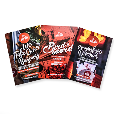
Image Quality
Although some flyers can be text only and just use this to their advantage to grand the attention of the readers, most are going to incorporate some form of imagery into them. With imagery, however, it is really important that it is of high quality and comes out clear when the flyer has been printed. There isn’t much worse than being handed a flyer — especially if it is advertising a new product – and the imagery being used is all pixelated and blurry, meaning you have no idea what is on it. Ensure that any image you provide is high quality, preferably 300dpi.
Colour
The right colour choices are vital when it comes to printing a flyer, as well as making sure that they have been set up for print and not for screen. Firstly, it is important that you choose colours which are going to catch the readers attention, as again you don’t want them just walking past without a second glance. But in saying that, it is also important that the colours compliment (A) The message that you are trying to get across and (B) Your own brand. There isn’t much point in choosing bright, vibrant and in your face colours if that isn’t what your brand is known for, as readers won’t believe that this is legitimate and from you. Second to this, make sure that when setting your flyer up for print, your colours are CMYK for print and not RGB which is primarily used for the screen.
Single or Double Sided
Finally, it is important to know whether you want your flyer to be single or double sided. This is important so that you aren’t sending two sets of artwork to a printer and expecting them to know and in the end, only one side is printed or the wrong artwork is printed. If you know the details like this before the flyers are sent off to print it will save your money so you don’t have to get reprints and also save the time of the printer, as they won’t have to print them for you again.
We hope that this article has been useful for you and provided the right information, so that you know what to be on the lookout for the next time you are creating a flyer and sending it off to be printed!