With so many design styles, it can be difficult to know where to start. Your business card should feel like an extension of your existing brand, so the design should be based on your logo, signage, or letterhead. If your business card is the starting point for your brand, consider how the same design will extend to all your other touchpoints.
What to add to your business card
When first starting to create your business card, you have to assess what elements you’re going to include. However, there are a few non-negotiables that you should consider:
- Your name. It’s important that your name is clearly visible and that it uses an easy-to-read font.
- Your company. You want the recipient of your business card to associate your name with the business you own or work for.
- Your current title. It’s important for the cardholder to easily link how you can help them. Whether you’re a CEO or a marketing manager, it’s helpful to provide as much context about yourself as possible.
- Contact information. Another essential piece of information to provide is your contact information. Whether it’s your best contact number, email address, or both.
Other items you can add to your business card includes:
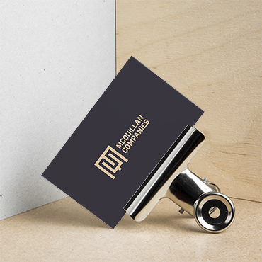
- Your company logo. Many people opt to add their company logo to their business card as a visual replacement for the company’s name on the card. This adds a sleek visual element to the business card and breaks up the text elements.
- Relevant social handles. For many in creative industries, social media serves as an indicator of popularity, authority, and success. For a polished look, you can simply add the social media icon with the social handle underneath. This can even be added to the back of your business card.
Seven business card design considerations
Here are seven design considerations to take into account:
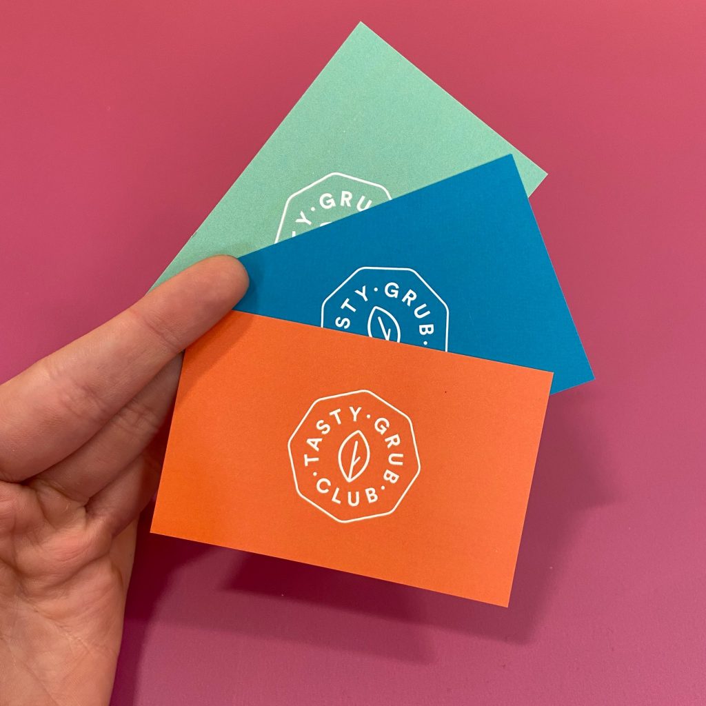
- Shape – Horizontal cards are the most common, but if you’re looking to stand out from your competitors, you could choose portrait format. Curved corners are an option, as well as imprints or die cuts. A completely different shape (say a circle) will result in additional costs so weigh-up whether it’s worth it.
- Size – We recommended using the standard business card dimensions so your card can be easily stored in wallets and business cardholders. Of course, if its impact you’re after, the sky is the limit but do consider how the recipient of the card will retain it. Too small and it may get lost, too big and it could be a burden.
- Design. It’s tempting to choose designs simply because you like them but it can be confusing for people who receive your card. A bright, colored design may not be representative of someone who works in the finance sector, just as a subdued, basic design is not a great introduction to an artist’s work. Think about colors or designs that represent your industry so it helps people understand what you do.
- Logo. A logo isn’t mandatory but it is a great way for customers to quickly and easily identify your brand, especially when it reoccurs across all your brand communication. If you feel your business card could use one, here’s how you can design your own.
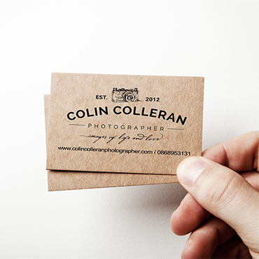
- Text. There are a few things every business card should feature, and in a particular order: Company name is followed by your first and last name, job title, and your contact details (phone number, email, web address, social handles). Any more information and the card can become cluttered so stick to the basics.
- Typography. When it comes to your details, legibility is key. It defeats the purpose if customers can’t read what’s on your card. Fancy cursive typography may look lovely but recipients may struggle, for example, figuring if it’s the letter ‘s’ or the number ‘5’. Use fonts that are easy to read.
- Texture. Never underestimate how a business card feels. If it’s too thin and flimsy, a card can feel cheap so you want to choose a quality paper stock. Also, consider what finish your card should have. A high-gloss finish results in a shiny look and feel, a matte finish has a slight sheen and is softer, while an uncoated finish uses the paper’s natural texture.