Each year in December, Pantone, who are best known for their Pantone Matching System, launch their colour of the year. This yeah the Color Institute has chosen PANTONE 16-1546 Living Coral, as their color of the year. Today we’re going to explain a little bit more about what this is and what it’ll mean for your leaflet printing or brochure printing.
What is Pantone
Pantone is a system for matching colours, used in specifying printing inks. If you want to get exact colour replication pantone inks can be used to print in that specific colour. This is most apparent in litho printing. In digital printing, we use technology and a mixture of CMYK inks to replicate Pantones as close as possible.
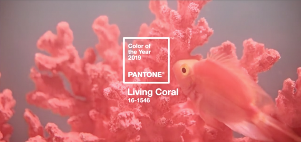
PANTONE of the Year 2019 – 16-1546 Living Coral
Pantone call Living Coral “An animating and life-affirming coral hue with a golden undertone that energizes and enlivens with a softer edge”. That’s all well and good, but as printers and designers what does that mean for us. In truth very little in our day to day, however for over 20 years, Pantone’s Color of the Year has influenced product development and purchasing decisions in multiple industries, including fashion, home furnishings, and industrial design, as well as product, packaging, and graphic design.
What do we think of Living Coral?
Well we love it, but the opinion is mixed. Some people love the vibrancy and warmth of the colour. Others feel it’s patronising. As with much of design, it can be polarising and is completely subjective to your own outside influences and interests. We’ll start to see designers using Living Coral and similar colours a bit more frequently over the next 12 months as it’s been given the spotlight an a lot of attention worldwide in all manner of channels including beauty vlogs, ad campaigns and digital print.
Pantone of the Year Selection Process
The Color of the Year selection process requires thoughtful consideration and trend analysis. To arrive at the selection each year, Pantone’s color experts at the Pantone Color Institute comb the world looking for new color influences. This can include the entertainment industry and films in production, traveling art collections and new artists, fashion, all areas of design, popular travel destinations, as well as new lifestyles, playstyles, and socio-economic conditions. Influences may also stem from new technologies, materials, textures, and effects that impact color, relevant social media platforms and even upcoming sporting events that capture worldwide attention. – Pantone
Getting the best colour replication
At Kaizen Print our state of the art digital printers replicate colours beautifully. Our team of eagle eyed printers will always ensure we get the best quality finish on all items whether flyers, brochures, booklets or banners. To place your order, find the product you need, upload your artwork and make payment right here on our site. We’ll take care of everything else and ship your order to you in record time.